ROLE
WHAT I DID
I worked as the principal UX designer, with a senior working alongside me.
The set-up of the project involved working closely with the strategy team from the outset as they had been working with the client on the long-term digital plan and this needed to be reflected in the outputs from the beginning.
I also worked closely with the data and SEO teams to ensure all the current site equity was not lost, carrying this forward and improving this for launch and the future.
THE APPROACH
The project was run into three key phases - discovery, planning and design.
Various outputs were executed across each phase, delivered and presented back to the client, with sign-off against each of the key phases that allowed us to move on to the next.
THE CHALLENGE
The user experience challenge was a little complex, not only was the task to create and build a fully immersive future-proofed site for e-commerce but to ensure it would work with and alongside multiple brand touchpoints both online and offline.
An initial stream of work had been undertaken to create a roadmap for Cadbury's digital presence, this included mapping the current Cadbury digital ecosystem and working closely with the client to unpack all the existing and future touchpoints - which stood at 40+. To this, we would need to address the current state of ‘Cadbury.co.uk’, which was currently behind industry standards and could not be further from the flagship experience we wanted to create.
"What role could the website play in future and more connected consumer journeys?"
We built an integrated team from various specialised disciplines within the VCCP partnership to answer the brief. This included the Bernadette digital team, data, SEO, planning and business teams from across the partnership, meaning that I would be working closely with all these teams to ensure our outputs were fully aligned before we engaged back with the client at any point.
To begin with, we created a list of principles for us all to work against. This allowed us to align in helping to transform the digital home of Cadbury into a flagship experience that it merited:
Grow direct relationships with consumers
More modern, dynamic, interactive & exciting
Current to the minute/moment & Comprehensive
Personalised experiences & customised offers
Listen & feature fans via community / UGC
Single source of truth for the brand & portfolio
We needed to provide Cadbury with the flexibility they required to evoke any e-commerce requirements in the future and establish a site framework and design from which this could start. All the time ensuring the interface was simple and intuitive for consumers to use, carrying through the brand ethos and design from the homepage to the product pages and everything in between.
To deliver this proposition we needed to create a future-facing design toolkit that could support a smooth handover for the client to use in a variety of situations. Notably the toolkit would be used by third parties when developing and building other digital experiences in Cadbury's digital ecosystem.
objectives
Articulating a clearer vision and purpose for Cadbury.co.uk within the context of the wider ecosystem.
Making the site a more valuable and repeat destination for our consumers, capturing essential data.
Leveraging existing touchpoints and loved initiatives (recipes, activations, brand campaigns etc) better in the website experience.
Framing the D2C capability in a future state website.
SOLUTION HYPOTHESIS
There was going to be quite a considerable jump from where Cadbury were presently to where they wanted to go and it had been agreed that it would be taken in clearly defined stages. It needed a large change in thinking and processes from the business to fully realise the future of Cadbury.co.uk.
Introducing the key requirements for the site would involve both large business and technical processes, so the plan was to gradually introduce various elements of these over the project stages. Validating and testing each stage and then moving on to the next meant that the business would be able to view and measure the impact. To do this a test and learn framework was created and a data dashboard was created from which we could create a baseline and measure.
But for the present, we had to start with the consumers…
MEET THE NEEDS AND GOALS OF CONSUMERS
Four visionary journeys had been created as part of the roadmap. Now we need to take these and ensure that they work for Cadbury.co.uk. We took the original thinking and work and created four website user journeys based on the visionary journeys:
Seasonal engagement - “I want to get into the spirit of Xmas.”
All year gifting - “I want to be generous with friends and family.”
Exploring Cadbury - “I want to learn more about Cadbury and their community work.”
Creativity and community - “I want to indulge my creativity and passions.”
We created four user flows based on the above and shown in the deliverables below. From this we created our final site structure and began to create the individual pages, coming back to these journeys each time to ensure alignment against these visionary journeys.
CONTENT WITH PURPOSE
Key to any good site is good content and from the outset, it was clear there needed to be a big change in terms of both the type of content and the quality. From high-impact content to regular engaging content that consumers would come back to and engage with it needed a good overhaul. Our content audit exposed the current state for all to see, unloved and in urgent need of attention. Our new content would allow us to create a baseline with which to grow and expand the content for the future in terms of quality and execution.
SEO was a key consideration for Cadbury and our SEO team worked tirelessly to ensure the site was optimised accordingly, incorporating keywords, working closely with myself and our copy team to ensure our copywriting and accompanying page metatags and titles were keyword-rich amongst many other factors.
DELIVERABLES
After each key stage of work, the findings were to be presented back to the client. Amends based on the feedback were implemented quickly after the initial presentations to ensure that the project moved forward rapidly and reduce any lag in the timeline. All relevant internal teams would come together when required as they worked on their areas and would present back collaboratively to the client.
JTBD - user flows
SIte map and templating
Guerilla testing against the user flows
Wireframes mapped with page purposes
Navigation and wayfinding mapping
USER FLOWS
Previous strategy and customer journey work was benchmarked to create user flows based on the key visionary journeys - how would each of these consumer types access and move around the website to achieve their goals? We created flows based on the jobs to be done. This indicated the likely key areas of content that would be consumed by each consumer type, which meant that we could plan our site structure and begin to unpack the content and features required in detail.
SITE MAP AND TEMPLATE MAPPING
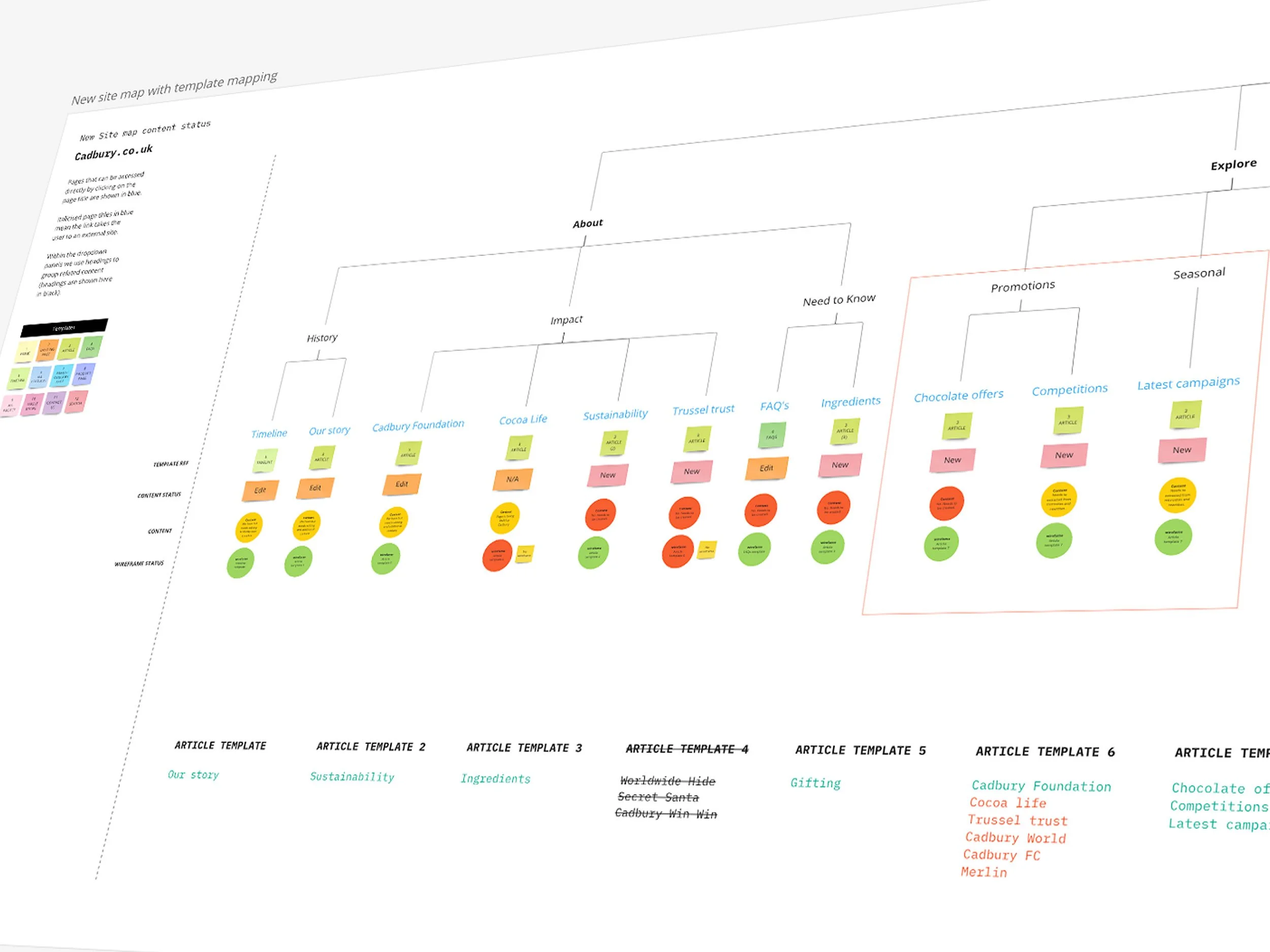
A sitemap was created quickly based on the user flows and initial brief of requirements from the client, this included new pages based on our discovery work, uncovering key pages of content that were common to Cadbury’s peers but that were not present on the current site. After we detailed the site structure we then planned out creating templates. This would aid the rapid deployment of future pages, while ensuring a consistent page structure and design at all times.
Guerilla testing
We created key mobile wireframe screens for the core journeys that showed basic areas of content to be able to test these quickly before refining them in more detail - we needed to know if our current thinking was right before we moved forward. We travelled to Cadbury World in Birmingham where we undertook testing with the public. Each test was 15 minutes long and we provided the participants with a Cadbury incentive frontaking part. The feedback was taken into refining the work in the forthcoming more detailed wireframes.
At the same time the design team began to create concepts of the key mobile screens based on the work from the UX, the brand guidelines while working to a newly created set of design principles for the website.
Components AND WIREFRAMES
To create each template we used a set of components that we had created based on the original design components, though these were essentially refined from the ground up as many were broken and used incorrectly on the current site. We created a set of usage rules alongside character counts to ensure the ‘new’ components could be used in various scenarios without breaking. Each template was then constructed from a selection of components and each template was assigned to a page on the website.
NAVIGATION AND WAYFINDING
It was essential that a consumer could quickly and easily find what they were looking for and in particular the vast range of Cadbury products that could be found on the site and thus a crucial experience consideration was that of the product filters. A deep dive into filter mechanics on e-commerce sites was undertaken to help us understand best practices and workings. We then drew out the recommended filters based on the Cadbury product catalogue and tested this quickly to ensure it worked accordingly.
PAGE DESIGNS (MOBILE)
Mobile was always the starting point and we knew we had some tricky key modules to design and build that had to work especially well at this breakpoint. I worked closely with the lead designer to ensure that all components met their required functionality based on the UX requirements we had created. We needed to ensure the components worked as a single entity but also when used together with others at a template level.
PAGE DESIGNS (DESKTOP)
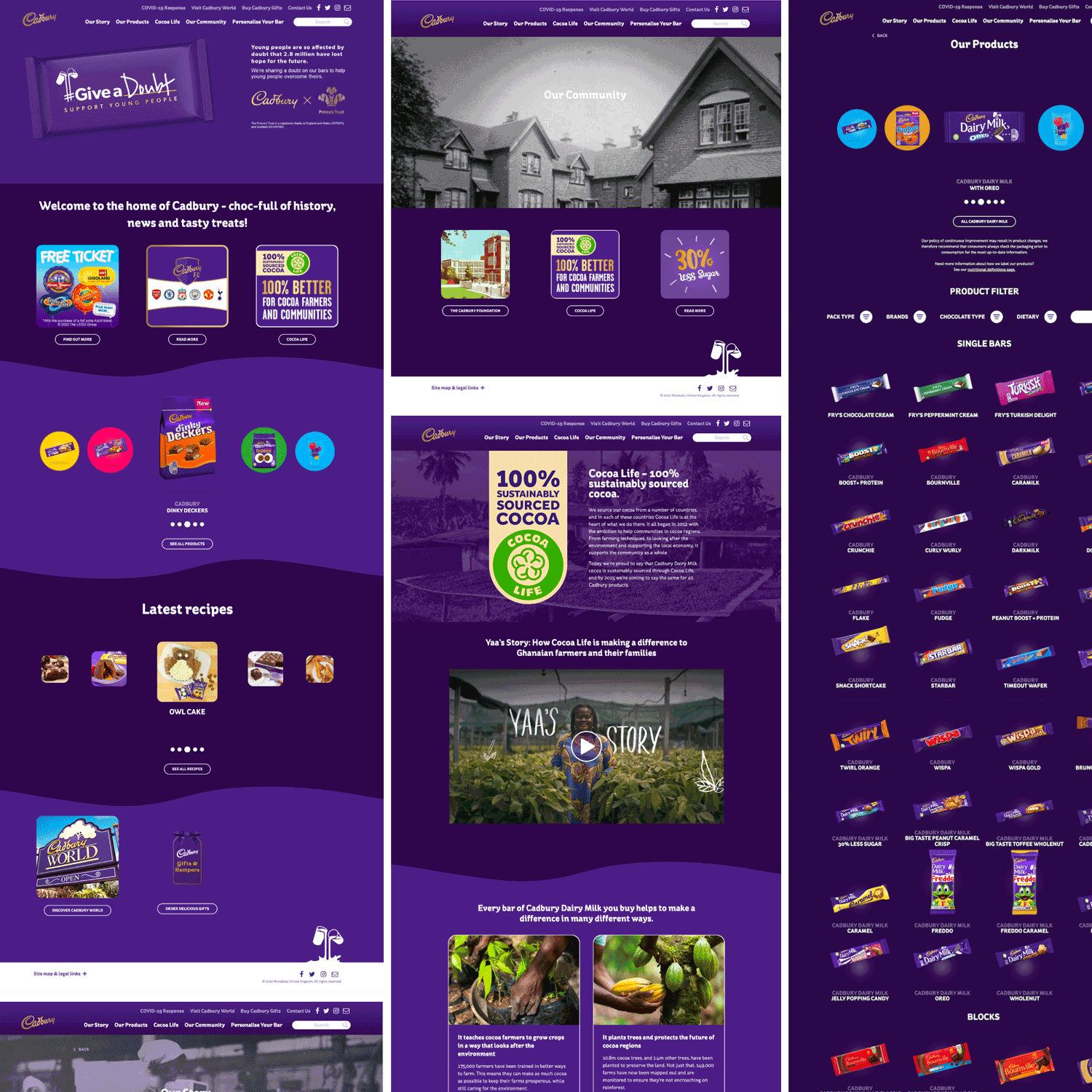
Desktop versions were constructed alongside the mobile versions, more so for the third party development company, which had requested that all breakpoint designs be created. The desktop designs allowed us more space and with that more freedom for the brand equity to breathe and gave us the opportunity to really show off some of the great Cadbury brand assets to the fore for the consumer.


