To develop a new website which promotes the new membership options for the 2018 season onwards.
ROLE
WHAT I DID
I lead the UX work producing all the research and ux design deliverables while overseeing other user experience designers for this project.
I alternated between presenting work internally in the war-room at the agency and client meetings at Wembley stadium itself (at the best box they have!).
A freelancer and another UX architect worked with me to help deliver the wireframes and interaction annotations in the final stages of the project.
THE APPROACH
The project was run in three key stages - a Define stage, a UX and Design stage and lastly a Development stage. I worked largely in the first two stages and inputted where required in the development stage.
I worked closely with a senior project manager throughout the project and fed back weekly to my UX director to ensure everything was on track due to very tight deadlines and a large client sign off process. I worked closely with the designer when required in the second phase.
THE CHALLENGE
The client felt that their current website offering did not enable them to showcase Club Wembley to its full potential. In addition, ongoing feedback from both members (core users of the website) and the client was that the current website was difficult to navigate and lacked depth of content for both members and visitors alike.
The website served two purposes; firstly, to promote Club Wembley from an acquisition perspective and secondly, to provide existing members with a dedicated portal to manage their accounts including re-selling/purchasing/transferring tickets, restaurant reservations, train reservations, option event purchases, etc.
Existing website challenges
Difficult to drill-down to information if you are not logged into the existing website as a member
No real-time assistance for visitors - only email or phone
Functionality and design looks, feels and acts dated
No search function within the site
Basic enquiry forms are not responsive and not tracked by GA
No social sharing
No WOW factor
No behavioural data captured
Minimal personalisation and only when logged in
Clunky CMS interface
With this in mind, after our initial meetings with the clients we proposed a set of top level objectives alongside the strategy and build proposal to coincide with the launch of the new livery and branding for Club Wembley. This would mean a super fast timeline for all stages of the project as there was little scope for movement.
The project involved a huge development challenge, due to the nature of porting the existing site onto a new domain and implementing a new CMS. Therefore we knew we would be restricted by both technical and time constraints.
TOP LEVEL objectives
Provide strong levels of enquiry for new and existing membership products
Integrate data capture seamlessly with CRM in real-time
Showcase all the benefits of memberships (including ‘Connections’ events)
Provide a personalised user experience which continually evolves as more data is captured
Enable members to carry out all account management functions via the members’ app or portal
Enable a mobile first approach
Provide live chat solution recommendation
Provide recommendations for new site functionality
RESEARCH
The initial stage involved us investigating the state of the current site, defining the site’s users and their requirements, looking at its peers and other sites that we could learn from and apply any learnings from into the new website. We created an agreed list of deliverables which started after an initial 2 day workshop that covered strategy, UX, content and technical planning.
DEFINITION PHASE deliverables
Stakeholder workshop
Requirements gathering, analysis and backlog population
Condit audit and analytics benchmarking
Best in class review
Proto-personas and task mapping
Site functionality - identify site elements that could support clients requirements
Draft new site taxonomy and content plan
SITE MAP AND CONTENT AUDIT
We mapped out the current site, both as a visitor and the logged in state of the site for members. We also created a content audit in Google sheets, again for both logged in and logged out visitors.
WAR ROOM
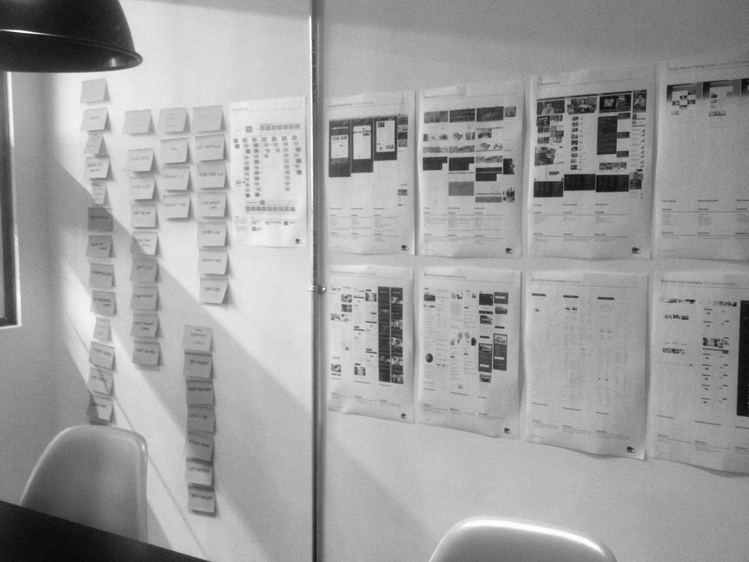
I created a small war room for the project. We used this to present our WIP with the client when they were at the agency. This enabled us to physically walk the client through our work all in one go, ensuring they could see our thoughts and workings throughout the project.
BEST IN CLASS REVIEW
A best in class review was undertaken. This included both in and out of category examples, alongside examples of modules and mechanics such as sales and comparison tools that could work on the new website and aid the requirements for acquisition journeys.
PROTO PERSONAS
Using the clients data it had gathered of its key customer base we created four key personas. These had to go through a rigorous sign off process throughout the FA to ensure we had covered the key users - especially for the acquisition journeys.
TASK MAPPING
We created a small task map to ensure we captured the expected tasks from the personas. We then bucketed the tasks into similar task groupings that could be mapped into the new site, from this we could see where new functionality would be required and any gaps in functionality that the current site was missing.
"A new positioning for Club Wembley that encourages the notion that life's rich experiences lie in the moment - being able to tell a story that no one else can. We have helped ensure that as a member your place in history is guaranteed and you can say with pride - 'I was there'."
SOLUTION HYPOTHESIS
Now we knew our audience and how they engaged with the Club Wembley website. We knew what information the client wanted to garner from the online enquiry page on the site to enable more targeted communication with prospective members. We knew the new products on offer intimately and we had a good understanding of how we tie all these ends togethers via a new website that could help to increase acquisition for them.
It was clear from the client’s stance that some instances of site functionality recommendations, such as live chat, view from your seat, as well as increased rich content (video and interactive) would not be deployed immediately at launch and would be rolled out in a later phase.
The deliverables followed directly from the signed off work completed in the definition stage. The UX and design stage was broken up into 3 weeks, with the design sprint starting in week 2.
Week 1
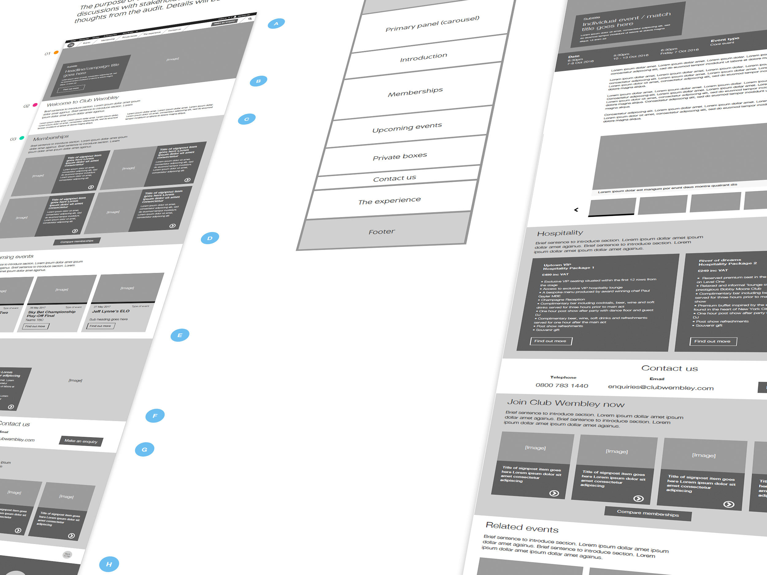
The focus of the first week was to create the initial site wireframes for review, based on the structure agreed in the sitemap. The wireframes were also reviewed from a technical perspective to ensure compatibility with the FA.com framework.
Week 2
We undertook a review session of the work completed in Week 1 - sharing the initial progress in a working session for review. Work continued with wireframe amends based upon the client feedback.
Approval was required on wireframes at the end of this week so the design sprint could start and I began to work with the designer as they started work on their first set of deliverables.
Week 3
Following client approval in week 2 the primary UX was wrapped up and the focus moved to creating the functional UX documentation to assist with detailed technical review and scoping for the development stage.
I also produced recommendations and examples of live chat with our technical director and created a comparison tool prototype for the website.
DELIVERABLES
In addition to the define stage deliverables. The UX and design stage deliverables consisted of templates for both the website and email, we also separated out the comparison tool and the enquiry form into separate deliverable assets as they were an important part for the new website.
Website templates and modules
Email templates and modules
Comparison tool
Enquiry form
Designs thereof of all the above
NEW SITE STRUCTURE AND COMPARISON TOOL
A new and very lean site structure was created and each page was assigned to a template allowing CMS users to select from a pre-defined range of pages. A comparison tool of the different tiers of membership was created that came out of the task mapping exercise.
TEMPLATED WIRE FRAMES
We took the new site structure and implemented a set of core templates across it, we used component modules to populate each template. A set of guidelines was also produced for final handover for users of the CMS.
EMAIL MODULES AND TEMPLATES
While working on the templates I also created an email template system for both acquisition and members. As both customer bases required different focus of content, we ensured the modules contained within the templates could work for both audiences.
EMAIL DESIGNS
Final designs were created based on the email module and templates UX. The look and feel was all part of the new brand launch livery and tied in with the website design.


